Dashboards That Actually Help You Decide What to Do Next

Because a dashboard that only looks good is basically office wallpaper. Mehenga wallpaper.
Looking for a performance marketing agency that delivers measurable results, not just impressions? CupShup combines data-driven performance marketing with on-ground activation across 10,000+ campaigns, helping brands optimize spend, maximize ROI, and scale what actually works.
Let’s be honest for a second.
Most dashboards are not useless.They are just… doing the wrong job.
They load perfectly. They refresh on time. They look great during reviews. And yet, when the meeting ends, everyone walks out thinking the same thing:
“Data toh dekh liya. Ab kya?”
That awkward pause is where dashboards usually fail. Not because the data is wrong, but because the dashboard never told anyone what to do with it.
Aur yahin se asli problem shuru hoti hai.
Dashboards Are Not Reports. Report banana alag skill hai.
A report explains what already happened.A dashboard should help you deal with what is happening right now.
This difference sounds small, but it changes everything.
Experienced teams do not build dashboards by asking, “What data do we have?”They build dashboards by asking, “Kal agar sab kuch thoda sa bigad gaya, what decision will we need to take fast?”
Budgets get cut. Traffic dips. Inventory piles up. Engagement drops silently before anyone notices. Targets slip quietly. Emails with words like “urgent” and “alignment” start showing up.
If a dashboard cannot help in these moments, it is not doing its real job.
This is exactly why platforms like Tableau are widely used for operational dashboards across sales, logistics, healthcare, and finance. Teams are not staring at totals. They are watching movement, patterns, and early signals that something feels off.
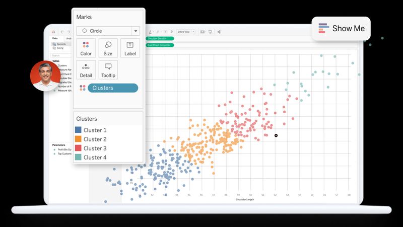
Tableau dashboard
Because in real life, change matters more than comfort, even more so in an ai-driven world.
Actionable Metrics Are Not Just “Important” Metrics
This is where many dashboards look confident but quietly fail.
A metric is not actionable just because it looks impressive or because an ai model surfaced it.A metric is actionable only if three things are clear:
- Who is responsible for it
- What action is possible when it moves
- What decision becomes easier because it exists
If a number changes and the reaction is only “interesting”, then that metric does not belong on a dashboard. It belongs in a report, a spreadsheet, or buried in documentation.
Experienced teams designing modern marketing solutions are very strict about this. They remove metrics that do not drive action or engagement. Not because data is bad, but because attention is limited. Too many numbers create noise. And noise kills clarity.
One Dashboard for Everyone? Sounds fair. Works terribly.
Executives skim.Managers dig deeper.Operators react quickly.
Trying to design one dashboard that works for all three usually means it works properly for none.
This is why mature Microsoft Power BI setups are structured in layers. Leadership sees direction. Managers see causes. Operations teams see what needs fixing right now.
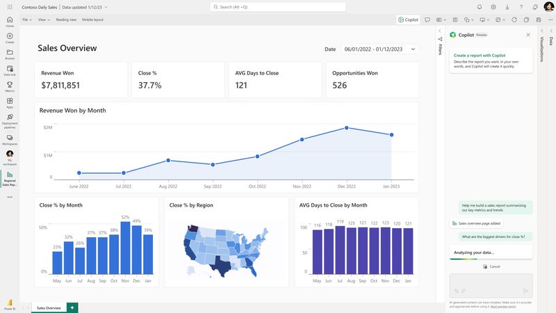
Microsoft Power BI dashboard
Retail teams use this structure to manage sales and inventory. Airports use it to manage passenger flow. Pharmaceutical teams use it to track clinical operations where timing and engagement matter.
Different views. Same data. Right depth.
Good Dashboard Design Is About Speed, Not Style
A dashboard that looks beautiful but takes time to understand is not a good dashboard.
The best dashboards can be understood in seconds. They use simple layouts, consistent positioning, and intentional color usage. Normal performance stays quiet. Problems stand out clearly.
When everything is highlighted, kuch bhi highlight nahi hota.
Experienced designers also think about habit. When users know exactly where to look every time, they stop thinking about the dashboard and start thinking about decisions. This is where ai-powered design systems and human intuition meet.
Interactivity Is Where Dashboards Get Interesting
Static dashboards answer one question.Interactive dashboards answer the follow-up question automatically.
This is where tools like Looker Studio work especially well for marketing and growth teams. Performance data almost never tells the full story upfront. Teams want to filter by channel, compare time periods, check segments, and understand engagement without leaving the dashboard.
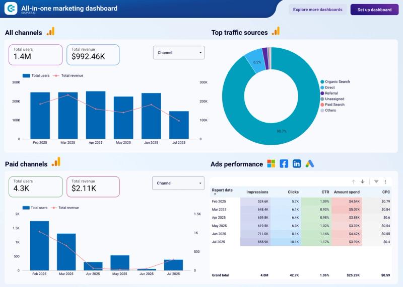
Looker Studio dashboard
The moment someone says, “Let’s export this to Excel”, the dashboard has already lost trust.
Good interactivity keeps people inside the decision loop, which is where confidence comes from.
Real-Time Data Is Not About Speed. It Is About Timing.
Not every dashboard needs real-time data. That is important to say.
But some dashboards absolutely do.
Experienced teams classify dashboards based on how often decisions are made. Strategic dashboards refresh weekly. Tactical dashboards refresh daily. Operational dashboards often need near real-time data, especially when ai systems are automating alerts.
In places like airports, hospitals, and supply chains, dashboards are used to act, not to reflect. Delayed data here does not just slow things down. It creates blind spots.
CupShup’s Own Dashboard. Built for Real-World Marketing Solutions.
Alongside external tools, CupShup uses its own internal dashboard to track all key metrics across campaigns, activations, and channels in one place. It is designed around how real marketing solutions operate on the ground, where decisions need to be fast, clear, and rooted in what is actually happening, not just what looks good on paper.
What makes the dashboard practical and decision-friendly:
Read next: Inside the Playbook: How Brands Can Measure the Impact of..., How to Measure Marketing ROI (Without Losing Your Mind), and Why BTL Is Becoming the New Performance Marketing.
Read next: Inside the Playbook: How Brands Can Measure the Impact of..., How to Measure Marketing ROI (Without Losing Your Mind), and Why BTL Is Becoming the New Performance Marketing.
- Brings together performance, engagement signals, and execution health in a single view
- Reduces dependency on multiple tools, sheets, and manual cross-checks
- Helps teams quickly see what needs attention today versus what can wait
- Makes it easier to track momentum across campaigns, not just final outcomes
- Keeps the focus on clarity and action, not over-analysis or visual clutter
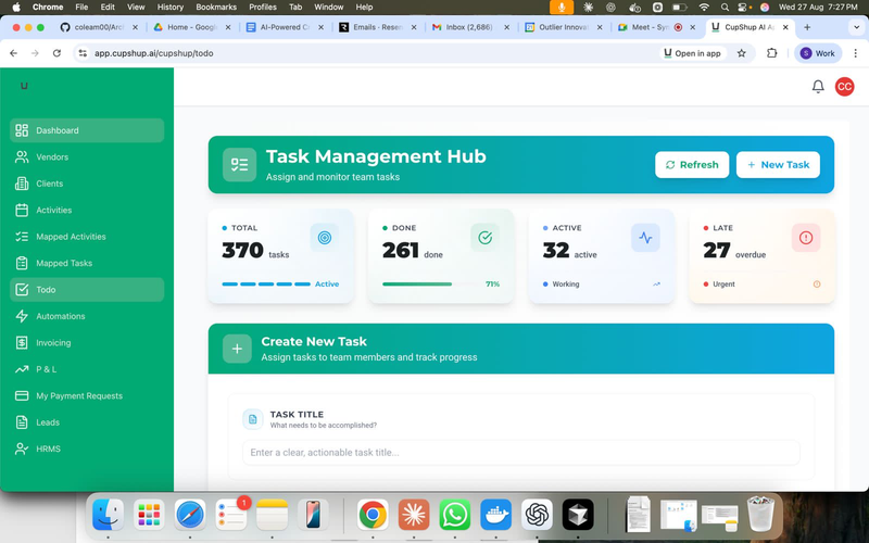
By keeping everything centralized and easy to interpret, CupShup’s dashboard supports better alignment across teams and faster decision-making, without overcomplicating the process or overwhelming users with data for the sake of it.
Why Brands Choose CupShup as Their Performance Marketing Agency
CupShup isn't just another performance marketing agency — we're a team that's built performance thinking into the DNA of 10,000+ brand activations across 300+ Indian cities. From hyper-targeted campaign planning and real-time ROI dashboards to conversion-optimized activations and AI-powered audience insights, our hybrid performance + experiential approach delivers results that pure-play digital agencies can't match.
What Seasoned Teams Build That Others Miss
The real difference between early dashboards and mature ones is not the tool. It is the thinking behind them.
Experienced teams almost always include:
- Benchmarks and targets so numbers make sense
- A clear flow from “Are we okay?” to “Why?” to “What should we do?”
- Alerts and thresholds powered by ai, not just passive charts
- Intentional removal of metrics that do not influence decisions or engagement
They treat dashboards as living systems. When a metric stops being useful, it is removed.
Business badalta hai. Dashboard bhi badalna chahiye.
The Three Questions That Decide Everything
Before calling any dashboard complete, experienced teams ask:
- If this number changes tomorrow, who reacts?
- What decision does this dashboard make easier?
- What would actually break if this dashboard disappeared?
If the answers are unclear, the dashboard still needs work.
Final Thought
Dashboards do not create clarity. Choices do.
But the right dashboard removes hesitation, aligns teams, and turns confusion into movement. It does not shout data. It quietly guides attention to the right place at the right time.
Aur jab woh hota hai, dashboards sirf screens nahi rehte.They become strategy.
Aur tab finally, you stop asking, “Ab kya?”Because the dashboard already told you.
Want dashboards that people actually use?
If your dashboards are being opened only during reviews, it might be time to rethink how they are built. Start with decisions, not data. Cut noise ruthlessly. Design for humans, not slides.
For more insights on dashboards, ai-driven engagement, and real-world marketing solutions, check out our blogs and follow CupShup on LinkedIn.
Or if you want to talk directly, drop us a note at contact@cupshup.co.in.Because data is only powerful when it actually moves people to act.
Ready to Get Started? Talk to CupShup
Whether you're planning a high-ROI campaign, optimizing your marketing spend, or looking for a performance marketing partner who gets results — CupShup's team is ready to help. Book a Free Performance Marketing Strategy Call →
50 Integrated Marketing Campaign Ideas
The complete playbook with campaign frameworks, budget templates, and measurement guides for Indian brands.
Instant download + email copy. No spam, ever.
Explore CupShup Services
Brands that read this article also explored these services.
AI Digital Marketing Agency
AI-powered campaign strategy, content, and performance optimization for growth-stage brands.
Learn more MarTechTechnology Marketing Agency
Marketing tech infrastructure — automation, data pipelines, and martech integration.
Learn more DigitalDigital Marketing Agency
Full-stack digital marketing — performance, social, content, and programmatic campaigns.
Learn moreCuppa CS
Digital Marketing Expert specializing in AI-powered marketing tools and automation. Cuppa CS helps brands leverage cutting-edge technology to optimize their digital presence and drive customer engagement.
Related Stories


Go Deeper with Our Free Guides
Comprehensive, in-depth marketing guides created by CupShup's experts.
The Ultimate Guide to Brand Activation
Everything you need to know about bringing your brand to life — strategies, examples, and frameworks.
The Ultimate Guide to Digital Marketing
Master every channel in the modern digital marketing ecosystem — from SEO to paid media.
The Ultimate Guide to SEO
The definitive guide to search engine optimization — on-page, technical, and link building strategies.